Auto Detailing Logo
Auto Fetish Detail
of
Orange County, CA
As a person I am balance between both logic and creativity. S0 when it comes to design, marketing, and advertising, I have always been self-reliant when it comes to crating a new logo for my auto detailing business.
I started Auto Fetish Detail back in 1988 and thought I would highlight the progression of the many detail logos I have designed throughout the years.
In the Beginning:
My first Auto Detailing Logo
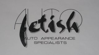
This is where it all began more than 25 years ago! This was back before the Internet as we know it today or even all the high-tech graphics computer programs. I literally laid this out with vinyl transfers that came on sheets of transfer paper.
I don't recall how many times I had to manually create the logo until I was able to line it up perfectly in order to go to print. I just know it was very time consuming and nailing the details was certainly a requirement for anyone who is old enough and knows the design world back in the 80's to remember these stick transfer lettering sheets you could use.
Even at this point the digital age had arrived at which point I simply kicked my 3D design to the print shop who then converted it into usable format for off-set printing.
At the time I was able to find "stock" font choices that I liked and was able to incorporate into this logo. Unlike numerous of the auto detailing logos before where I literally hand drew the stylized fonts, this case was unique in that the fonts had already been created.
It was simply up to my creative brain to pick and arrange in a way that worked for me.
Auto Detailing Logo#2
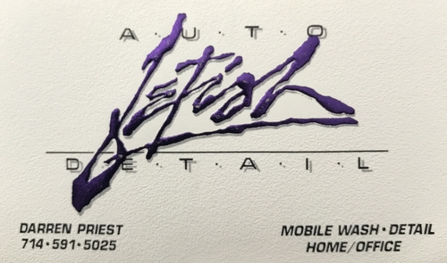
If I thought the first logo was difficult, this one was 10x the effort of the first one:
- I designed the hyper-stylized font of the "fetish" myself freehand.
- Had graphic artist convert to digital.
- Wanted the logo to not only be embossed, but foil stamped using a purple foil.
- Cost me about $1.00 per each card by the time I was done; that was $500 for 500 cards. Crazy expensive! But I want what I wanted even back then. As the saying goes, "It's all about the details".
- The rest of the card text was traditional print with black and half-tone for the drop shadow.
Auto Detailing Logo #3
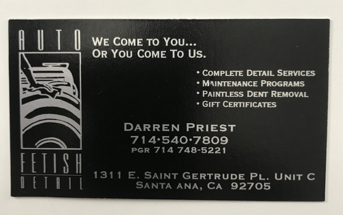
This card appeared during the 90's when I opened a brick and mortar shop in Santa Ana, CA where we did wholesale and retail detailing. I also had about 3-5 fully contained mobile units servicing the Orange County area doing mobile washing and detailing; talk about the headaches!
I went back to traditional printing with the exception of printing on glossy black card stock and silver ink.
Auto Detailing Logo #4
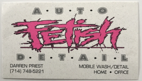
This was my next crazy design I came up with where I literally drew out the stylized font of the FETISH. I also changed graphic designers at this point and the guy freaked when I showed him my ideas; he loved it! Of course it took him many hours to draw out my exact font into a computer graphics program.
But once again, I knew what I wanted and wasn't going to give up till I was happy.
I also loved it so much that I and ended up doing company T-shirts with this logo on them. At the time I think the outrageous font was appropriate for the name.
Auto Detailing Logo #5
At this point I would have been into the late 90's and then some. I reverted back to a more conservative font, but kept things provocative with the added tag line; once again I wanted to stir the pot with some added layer of innuendo.
This was also the point where I started to add the bullet point within the design of the logo.
Auto Detailing Logo #6
This next logo was the most comprehensive logo I had ever designed up to this point. It required more time on my part than ever before to finally nail down a design that matched my vision at the time.
I knew I wanted a crest or shield of some sort and was after a look I am unsure as to what it would be called within the art/design community with the added wings/floral/sunburst in the background.
I had he concept in my head for a long time before I even attempted to put it down on paper (or digital format). Since I do not know the professional quality digital programs for design work, I generally have to find ideas in the form of drawings, photos, illustration and throw all these at my graphic artist who then comes up with a rendition as to what he thinks I am after.
This particular design took about 9 months from original inception on my mental imagination before it finally materialized into this final version.
Ironically, it was also the shortest lived logo I had ever used up to this point; perhaps a total of two years if I had to guess.
Auto Detailing Logo #7

After the very elaborate design prior to this logo, I decided to default back to a font I had used previously that I really liked, but wanted to add not only a "star", but a somewhat stylized star as you can see.
I added some half-tones to create gradient shadowing and I finalized it with the version you see here.
Auto Detailing Logo #8
At this point I had defaulted to keeping the bullet point in between the AUTO and the FETISH of my auto detailing logo.
I had a concept of the type of font I was after and after much research, found a font that matched my idea. I had my graphic artist tweak the font just a bit while adding the bullet point to it.
Based on a few of my other designs I had come full circle with this detailing logo in the way of simplicity.
I liked the way this logo has a bold outline that allowed me to print this in numerous ways based on the background color. I could toggle between a logo that was a solid color, or create an automatic color to the logo with using only the outline. (hard to explain in word)

Latest Auto Detailing Logo
Here is my latest logo that was about 6 months in the making. From the original concept that started to formulate in my head to the final version, it is a process that goes through many stages until I finally decide on a completed version.
Every logo is different and totally unique —at least that is generally my goal. With that said, there are times when I simply want to tweak a logo into a slightly updated version.
As you can see from all the different logos I have designed and used; most are pretty unique!

With the above 3 versions it shows how I designed the original Auto fetish logo and then added a tag line along with a variation to the original design to come up with a provocative back T-shirt design. (I love to stir the pot)
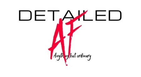
While most of the auto detailing logos I have created ended up being T-shirts, this last one is the only one I have for you at this time.
Once again I took two letters AF and stylized them free hand. At that point I kick my drawings to my graphic artist who must now convert my drawings into digital format for printing.
For me being a very visual person who is highly creative, I am very particular in my designs and despite how long the process can take, I do enjoy the designing of them.
You can see that in the actual company logo I stuck with the bullet point in the middle of the AUTO and the FETISH.
Apparently I like this aspect of my design...
To date I would have to say that this design remains as one of my favorites. We will see how long it lasts.
Sincerely,
Darren Priest
- Home
- Auto Detailing Orange County
- This Page
|
|

